Clearly, I'm a fan of sketches. But even using those can be a burdensome drain on my sensibilities when I'm scrapping late at night or in a rush to get pages done. Looking over my albums, I find there's one tried and true layout I come back to again and again when I want a simple photo-focused page: the gap grid.
Quite simply, this layout is a grid of multiple photos, in the same or various sizes, with a 1/4" gap between the pictures. I usually use an over sized mat to accommodate all the photos and sometimes the title.
I discovered this layout early on and have used it repeatedly because of the sleek, uncluttered look as well as the fairly short time it takes to assemble the page. It works for single and double page layouts and is a great way to keep the photos the centre of attention.
 |
| My first page using a gap grid. The gaps and colour scheme make the photos pop off the page. |
 |
| Inspired by a layout I saw in SBE, this small gap grid keeps the photos the focal point against the busy background. |
 |
| With whimsical florals and stitching details, the strong geometrics of this gap grid add a masculine balance to the page. The impact of a large block among the rounded elements is softened by a popped-up floral title which covers some of the negative space between the subjects of the photos. |
 |
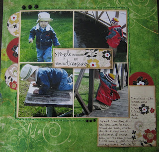
| Photos are the star of this simple, quickly assembled page. The mismatched title tiles match the playful theme of the page and journaling along the perimeter of the grid completes the story. |
If you're looking to try something new or are looking to put together a big-impact page in a short amount of time, try the gap grid!


No comments:
Post a Comment